
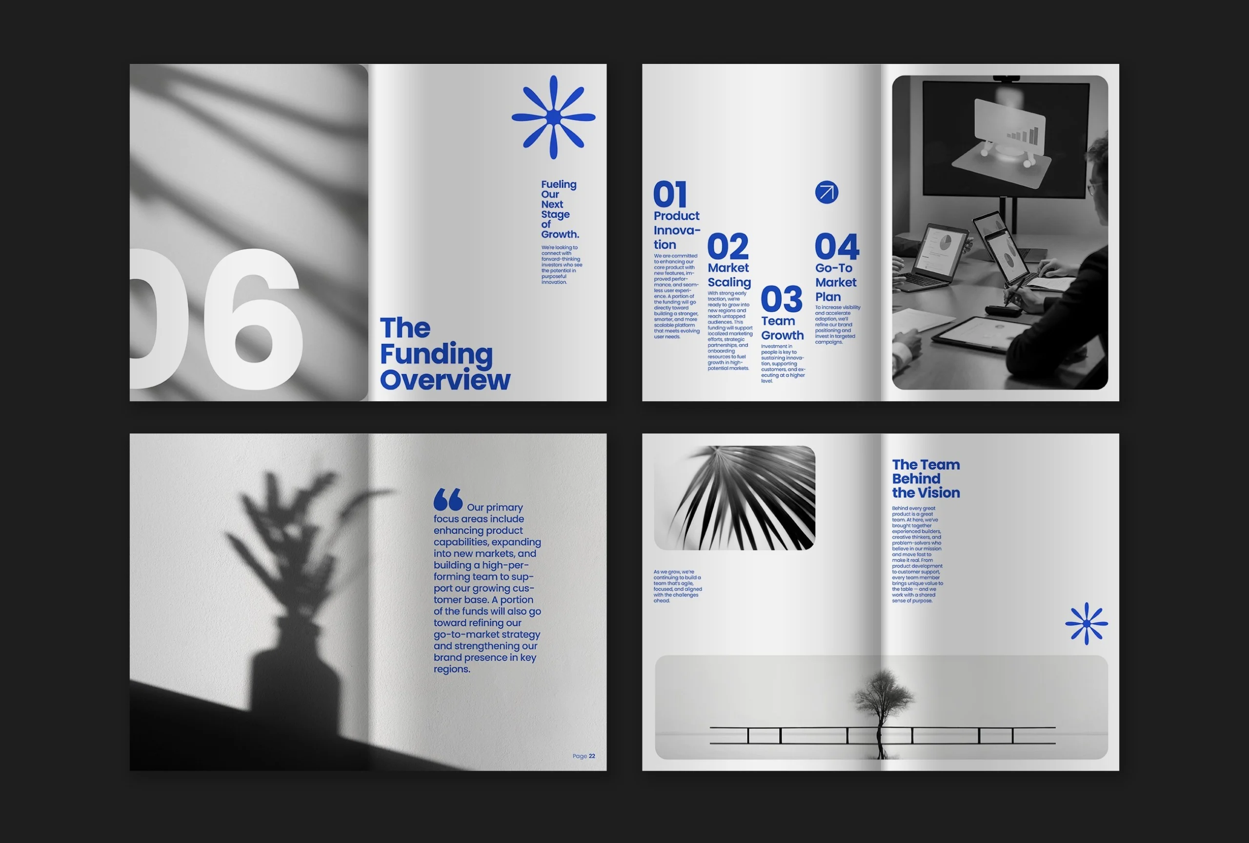
A new logo, a carefully selected colour palette, a typeface that finally represents the company. Then, six months later, the flyer printed by the local printer has a different shade of blue, the social media post uses a random font, and the logo on the van has been stretched to make it fit the available space. It is not carelessness: nobody ever wrote down the rules. Brand guidelines exist precisely for this.
They are often associated with large companies and manuals hundreds of pages long. In reality, brand guidelines are even more useful for small businesses, which work with different suppliers, external collaborators and little time to check every detail. This article explains what brand guidelines are, what they should contain and how to build a set of rules that people will actually use.
What are brand guidelines, and what are they not
Brand guidelines are the document that collects the rules for using a company’s identity: how to use the logo, which colours and typefaces to choose, what style images should have, and how the brand writes and speaks. They are the brand’s instruction manual, designed so that anyone who uses the identity — employee, printer, agency or collaborator — always achieves the same result.
Brand guidelines are not a portfolio to show clients, nor a celebratory document. A manual that only presents the logo with beautiful images, without explaining how to use it, is a catalogue, not a practical guide. The value of brand guidelines lies in the rules: measurements, codes, examples of what to do and what not to do.
They can be called in different ways: brand manual, visual identity manual, brand guidelines or visual identity guidelines. The names change, but the function remains the same.
Why brand guidelines are also useful for small businesses
A large company has a marketing department that checks every piece of communication. A small business does not. Materials are prepared by different people at different times: the designer who created the logo, the local printer, the person managing social media, the supplier producing the sign. Without written brand guidelines, everyone interprets the identity in their own way.
The result is a brand that always looks slightly different, and a customer who does not recognise it with confidence. Consistency is not just an aesthetic issue: it is what allows a company to be remembered. We discuss this in more depth in our guide to brand identity, where we explain why identity is a system and not a single logo.
There is also a very practical benefit: time. With brand guidelines, every new supplier receives a clear reference and can start immediately in the right way, without endless rounds of drafts and corrections. For a small business, where every hour of work costs money, this is a real saving.
What complete brand guidelines contain
There is no single table of contents that works for everyone, but well-made brand guidelines always cover some fundamental areas.
The foundations. Who the company is, what it does, who it does it for and which values guide it. A few pages are enough, but these are the pages that give meaning to all the rules that follow: without a why, graphic choices remain form without substance.
The logo. This is the most technical and most frequently consulted section. It contains:
- the logo versions: main, horizontal, vertical, and the symbol on its own for square formats such as the social media profile image
- the clear space, meaning the minimum empty space that must surround the logo
- the minimum size below which the logo is no longer readable, both in print and on screen
- the versions in colour, black and white, and reversed on a dark background
- prohibited uses: a stretched or compressed logo, a rotated logo, unapproved colours, shadows or effects, or placement on backgrounds that make it unreadable
The colours. Every brand colour should be specified with all the necessary codes: HEX and RGB for screens, CMYK for print, and, where possible, the Pantone reference to achieve maximum accuracy at the printer. This is the detail that prevents the famous blue from changing from one supplier to another.
Typography. The brand’s typefaces, with an indication of which one to use for headings, body text and details, as well as alternatives to use when the main typeface is unavailable, for example in a shared document or an email.
Images. The photographic and illustrative style: lighting, colours, subjects and type of framing. Explaining what to choose and what to avoid helps anyone selecting an image remain consistent.
Tone of voice. How the brand writes: direct or formal, technical or simple, with concrete examples of correct and incorrect phrasing. An identity that always looks the same but reads differently every time remains only halfway complete, as we explain in our article about brand voice.
Applications. Practical examples of the identity in use: business cards, letterheads, email signatures, social media templates, signage and packaging. Seeing the finished result explains more than any abstract rule.
The mistakes brand guidelines prevent
Anyone working in the sector sees them every day, and they almost always result from the absence of written rules:
- the logo stretched or compressed to fit a space
- the wrong colour because someone picked it “by eye” from a photo
- a low-resolution logo downloaded from the website and used for a large print
- too many different typefaces in the same material
- the colour logo placed over a photograph that makes it unreadable
Brand guidelines do not eliminate mistakes by magic, but they give everyone a reference for avoiding them and give you a tool for correcting them without arguments: the rule is written down, so all you have to do is follow it. For logo files, it is always worth including the vector versions, as we explain in our guide to the vector logo.
Who should create the brand guidelines
The person best suited to write brand guidelines for an identity is the person who designed it. They know the reasons behind every choice, understand which areas allow flexibility and which do not, and already have the original files in the correct formats. For this reason, in a well-designed visual identity project, brand guidelines are not an extra to request afterwards: they are part of the delivery.
If the identity already exists and was created by someone else, it is still possible to build the brand guidelines from what exists, but first there needs to be some reconstruction work: recovering the original files, checking the colour codes, identifying which typefaces were used and under which licence. Sometimes this work reveals issues that need to be solved first, such as a logo that is only available as a low-resolution image.
At the time of delivery, it is always worth receiving, together with the brand guidelines, a folder containing all the ready-to-use files: the logo in every version and format, the fonts or instructions for obtaining them legally, and templates for the most frequently used materials. Rules without files remain theory; files without rules end up being used incorrectly.
Brand guidelines in PDF or online?
The most common format remains PDF: easy to send, archive and print. It works well for small and medium-sized businesses, especially when accompanied by a shared folder containing all the ready-to-use files: logos in different formats, fonts and templates.
Larger organisations are increasingly choosing online brand guidelines, either a private or public page that is always up to date. The advantage is that there are no outdated versions circulating: whoever consults them always sees the current rules. Many large organisations publish their brand guidelines online, and browsing through some of them is an excellent way to understand the level of detail possible: a good overview with famous examples can be found in this in-depth article about brand books by MySocialWeb.
How long should brand guidelines be?
The right brand guidelines are the ones people actually read. For a small business, fifteen or twenty pages are often enough if they are well organised, with plenty of images and few words, and clear rules from beginning to end. A hundred-page manual that nobody opens is less useful than a short one that the printer actually consults.
The structure also matters greatly. The most frequently requested information, such as logo versions and colour codes, must be easy to find, perhaps summarised on an opening page. Whoever opens the brand guidelines is usually looking for a specific answer and should be able to find it within a few seconds.
How to keep brand guidelines up to date
Brand guidelines are not a document to write once and forget. The company grows, new channels appear, new formats and new requirements emerge. A new social network may require a different image format, while a new service may require a logo application that was never anticipated.
It is worth reviewing them at least once a year, updating the applications and adding new cases that have emerged in the meantime. And when the identity changes substantially, through a redesign or rebranding, the brand guidelines should be rewritten together with it, not afterwards.
Where to start with brand guidelines
If your company already has a logo and colours but no written rules, the first step is to collect what already exists: the original logo files, colour codes and the typefaces being used. Often this process alone reveals inconsistencies that had gone unnoticed. From there, brand guidelines can be built in proportion to the size of the company, without going overboard.
If you want clear, practical brand guidelines designed to be used every day by the people who work with you, request a free consultation: we start from your current identity and turn it into rules that anyone can follow.