
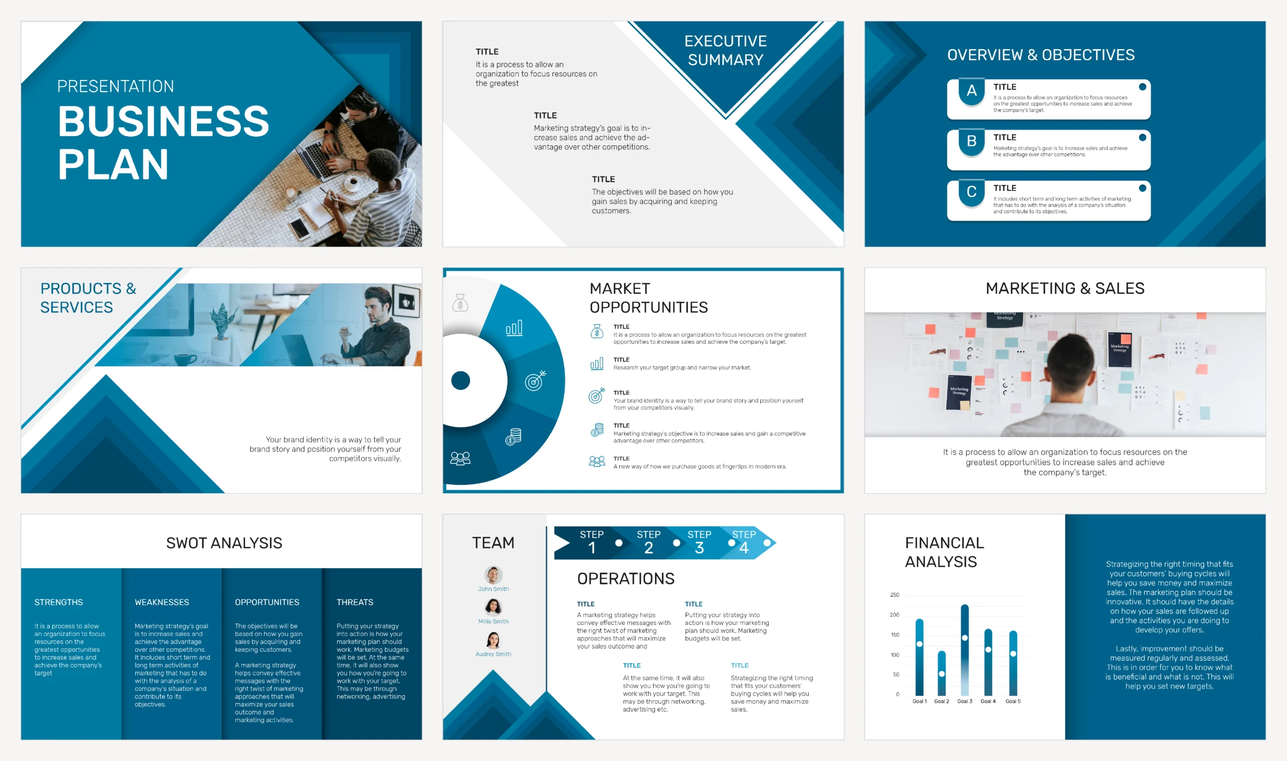
There’s a curious inconsistency in how Italian small and medium-sized enterprises invest in their visual communication. The website gets careful attention, the logo is designed with method, social media has an editorial plan. Then the moment comes to put together a presentation for an important client, an investor, or a business partner, and someone opens a blank file with the system font and the default background.
This article is about an aspect of corporate communication that gets very little professional attention relative to the real impact it has: presentation design.
Business presentations deserve the same care given to a website or a logo, but rarely get it.
Why business presentations matter more than we think
Business presentations aren’t just any internal document. They’re often the material that accompanies the most decisive moments in a business relationship: the proposal to an important client, the pitch for investment, presenting results to a partner, training a new team member on how the company works.
In these moments, the visual quality of the presentation communicates something specific about whoever is showing it, even before the content is absorbed. Cluttered slides, with mismatched fonts, inconsistent colors, and improvised layouts, convey a sense of carelessness that colors the perception of the entire proposal, no matter how solid it is on its merits.
This doesn’t mean content doesn’t matter. It means excellent content presented poorly loses some of its persuasive power, while the same content presented with visual clarity lands with more impact and gets remembered better.
That’s why business presentations should never be left to last-minute improvisation.
The most common mistakes in Italian business presentations
Too much text per slide. Far and away the most common mistake: whole paragraphs copied onto a slide, which the audience can’t read while listening to the speaker, forcing them to choose between reading and listening. An effective slide communicates one concept at a time, with the fewest words necessary to support it.
No consistent visual system.
Different fonts from one slide to the next, colors that change with no logic, inconsistent heading sizes. Every slide looks like it was made at a different time, because often it was: assembled over time, copying layouts from previous presentations without ever unifying them.
Illegible or misleading charts.
Pie charts with ten different categories, unlabeled axes, colors that don’t help distinguish the data, or worse, scale choices that visually distort the information they’re supposed to communicate clearly. A chart should make data easier to understand, not require a separate explanation to be interpreted correctly.
Low-resolution or irrelevant images.
Generic stock photos downloaded without much thought, pixelated when projected on a big screen, or simply disconnected from the specific content they’re meant to support. The wrong image is more distracting than no image at all.
No information hierarchy.
Heading, subheading, and body text all carry the same visual weight, forcing the viewer to work out on their own what’s most important instead of being naturally guided through the information.
These five mistakes repeat with surprising regularity across Italian business presentations, regardless of industry or company size.
How to build a company template that actually works
The structural solution to these problems isn’t fixing each presentation one at a time, it’s building a company template consistent with the brand’s visual identity, one that gets reused for every new presentation.
A professional template includes a limited color palette consistent with the brand’s, not the entire range of colors available in the software but three or four colors with specific roles: one primary, one accent, one or two neutrals for text. It includes a defined typographic hierarchy, with precise sizes for headings, subheadings, and body text, so that whoever is putting the presentation together doesn’t have to decide from scratch every time. It includes predefined layouts for the most common use cases: opening slide, text-and-image slide, chart slide, closing slide with contact details. And it includes supporting graphic elements, like coordinated icons and geometric shapes, that let you communicate visually without having to hunt for a stock image every single time.
With this system, anyone in the company who might need to put together a presentation, not just whoever handles communications, has a solid foundation to start from, instead of rebuilding everything from scratch with inconsistent results over time.
A solid template is the investment that makes every future business presentation easier to prepare and more effective to use. Harvard Business Review’s guidelines on building effective slides confirm that a few clear principles, applied consistently, matter more than any design software.
The three-second slide principle
A practical principle that applies to every single slide in a professional presentation: whoever is looking at it should grasp the main point in about three seconds, before the presenter even starts talking about it.
This comes down to a few simple rules that often get ignored. One main idea per slide, not three or four crammed together. Text pared down to the essentials, with short phrases instead of paragraphs. Enough contrast between text and background for readability from a distance, given that a slide projected in a meeting room looks different than it does on the computer screen during preparation. And generous white space around elements, which isn’t wasted space but exactly what lets the eye rest and focus on what matters.
Presentations that follow this principle are perceived as more professional even by an audience that couldn’t quite articulate why. It’s a perception built through dozens of small design decisions that are all consistent with each other.
Applying this principle systematically is what separates truly professional business presentations from the ones thrown together at the last minute.
Presentations and consistency with the wider brand identity
Business presentations shouldn’t be isolated artifacts, but a natural extension of the visual identity system already used on the website, on social media, and in printed materials.
Same colors, same typography, same graphic style, applied consistently on a different medium.
This kind of consistency builds recognition over time: a client who has already seen the website and then receives a business proposal with the same visual identity perceives continuity and professionalism, an implicit but powerful signal of the company’s reliability.
In this sense, business presentations are a genuine brand touchpoint too.
To dig deeper into how to build a complete visual identity system, of which the presentation template is one application, read our guide on brand identity for SMEs. To understand how file formats affect the quality of materials across every medium, read our deep dive on logo and graphic file formats.
An investment that pays off with every use
Building a professional presentation template requires an upfront investment, but unlike a single custom-made presentation, this investment pays off with every subsequent use. Every new business proposal, every pitch, every internal presentation starts from an already polished foundation, drastically cutting the time needed to prepare it and raising the perceived quality on every single occasion.
For a company that regularly presents to clients, investors, or partners, business presentations aren’t a minor aesthetic detail. They’re a communication tool that works, literally, every time someone in the company opens that file to prepare for an important meeting.
Business presentations built with method become one of the most heavily used communication tools a company has, and one of the least costly over time.